A lot of fans like good court design on the floor of their home team. Some teams are really struggling with the looks and have to change it every couple of days. Here are the teams that got it right and don’t have to change a thing about the design of their floor.
5) Golden State Warriors – That yellow combination with blue lines has looked great over the past couple of years. They have turned to the yellow color, and we think that it didn’t disappoint them as no changes to design in the past couple of years were implemented.

4) Charlotte Hornets – Honeycomb design on the floor is looking pretty smooth with those different shades of blue. Dark blue on the floor and sky blue on the outside are pretty fitting for the returning Charlotte Hornets.
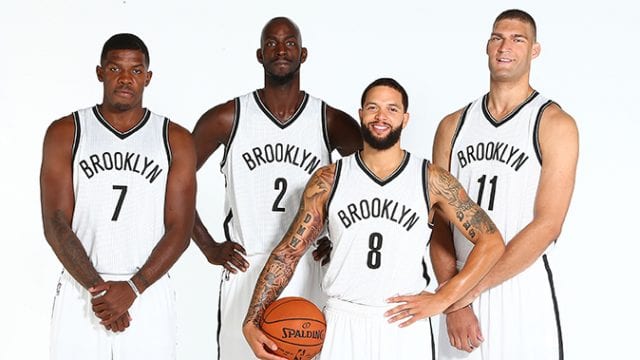
3) Brooklyn Nets – Their parquet style with that black color fits their logo and their jerseys. Even though their uniforms can be a bit better, their court design is spot on.

2) Boston Celtics – Celtics floor is one of the most iconic things in the history of the NBA. They haven’t changed their court design in over half of century. They have tweaked it, but green color with the Celtics parquet is a combination that is still dominant in TD Garden.

1) Los Angeles Lakers – Just like the Celtics, their home floor is iconic in the history of the NBA. Purple and gold combination works the best for the Lakers. They tweaked their design couple of years ago. Now, it looks modern and pretty good. If they had chosen to use their old design, we would have dropped the Lakers on this list for a spot or two. But, this new layout puts them right at the top of the league. Great lighting in the crowd helps the look of the court as well.
