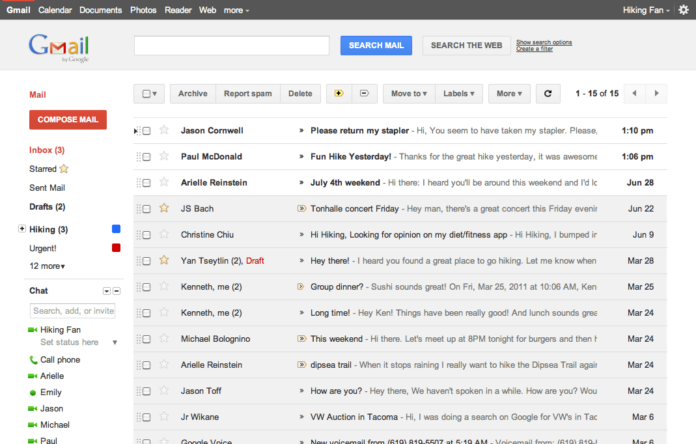
Owners of Gmail are all revved up for the introduction of a new way of viewing emails like never before when viewed on smartphones. It will look like something made for small screens and not the layouts that are squashed as seen on desktops.
This much better-looking email is expected to be debuted when Google embarks on creating support for what is known as “responsive web design” for inbox by Gmail and Gmail itself. When this is done, developers will be able to build emails that look much better and also quite easy for the users to view and communicate with despite the device they are using to do so.
This will better support emails that make use of visual communication more as is the case with the example Google offered on YouTube showing 4 video thumbnails that are packed onto the display. With the coming new styles, the developers will be allowed to reformat the email automatically for screens that are smaller.

Some of the quirks that are experienced while accessing emails on smartphones that is as a result of one –size-fits-all desktop-led which makes the buttons, links or texts to become squished on mobile devices that are small-screened.
Google noted that in the later part of this month, emails from Gmail will allow emails that have a responsive design so that the content can fit whatever size of the screen.
They also added that links, buttons, and texts will enlarge when viewed on a smaller screen so that they can be tappable. The changes will also be seen on the desktop.
With the use of Cascading Style Sheets (CSS) for rules concerning media, developers will get support for their responsive designs which will be able to adjust the format automatically based on the rotation, width and resolution so that emails can be better viewed on tablets, desktops, and phones.
Google has plans to expand the list of the inbox and Gmail supported queries that are currently available.


