Google is primarily known for taking its advertising aspect very seriously despite venturing into hardware business recently. A lot of people are relying on its monetization tool for online contents, Adsense- which has also gotten a coat of paint for its website’s Material Design.
Although some may argue that people are not in the least interested in looking on to see the beauty of Google’s Adsense, but it is still worthy to point out that Google has put in some effort to see that its visual language is looking better in service rendering and apps that are related. This in some way shows that Google can be consistent with a project which is something Google is yet to be known for.
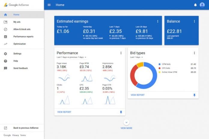
What then are the changes we are to expect you may ask? Well for one, the website is more attractive with the ever anonymous grey taken over by a more vibrant blue that is sufficiently not obstructive. You can now easily identify the “Estimated earnings” card and also where you can see your balance. All other information can be seen on the card below.
You can see cards pinned as you have in the inbox in emails where you also have the choice to rearrange them in whatever manner you prefer. There is also the Material hamburger menu that Google is implementing that does not need help in recognizing what size your window is and if it should be kept open or closed depending.
image source: androidpolice.comYou also get to see beautiful animations of Material Design all over the website that gives you a better feeling and look when on the website. This may not be much but to someone who checks Adsense constantly, this may be a welcome development. Users are also given an option of whether they want to make a switch back to the old version.
You can share with us your experience with Adsense if you have seen the improvement done on it.


