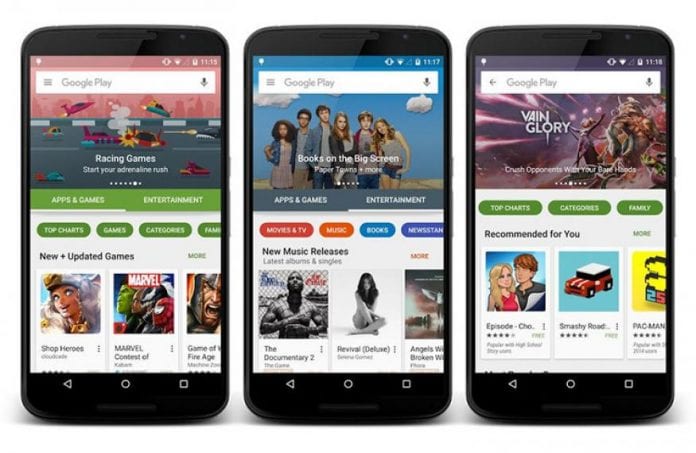
Google is giving one of its major stores a huge makeover. Because most, if not all, apps are updated all the time, it is only fitting to also update its place of residence. The Android Police had spotted a number of UI transformations on the Google Play Store. Google had indeed been trying out some changes on its user interface.
You can head over to the Play Store to see these major cosmetic changes for yourself. The first thing you will notice is the Entertainment section. The carousel also got a new look and it has a new Google play banner. Don’t even bother looking for the search bar because you will not find it there anymore. It has been removed for some good purpose.
You might be wondering. Where did the search bar go? Well, nobody knows but no worries because it has been replaced by this green bar with a hamburger menu. It also comes with a new branding and a microphone icon. That means you already have two options for searching apps. Either you type in the name of the app or say the words out loud. This voice search feature is truly an interesting addition to the Google Play store.
Moving over the updated carousel, the aesthetics are quite remarkable. Card – like icons replaces the stretched-out hero images on the Entertainment section. More importantly, these icons work independently. They no longer dwell behind the search bar or even the hamburger menu.
The arrangement of these Entertainment apps also has changed. Everything has been rolled into one in the new Google Play store interface. You can already see all your apps in one place instead of having to go through different sections according to the type of app that you are looking for.

Redesigning is not a foreign concept for Google. This Internet giant often making updates to all their products and services. It they can make changes to all their other products, then Google Play store is no different. Seeing a new look on the Google store from time to time is never a surprise.
However, it must also be noted that these are not permanent. GSMArena is the ultimate source of handset information and it has pointed that Google is conducting these UI changes as a kind of beta test. It is yet unclear that these will be made permanent or not. But isn’t that the ultimate secret to success? You need to be willing to embrace change if you want continuous growth and progress.


