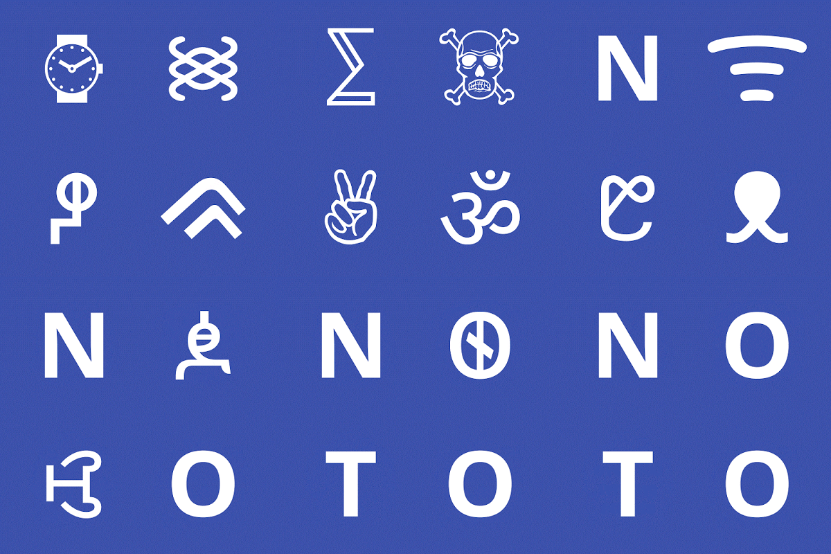
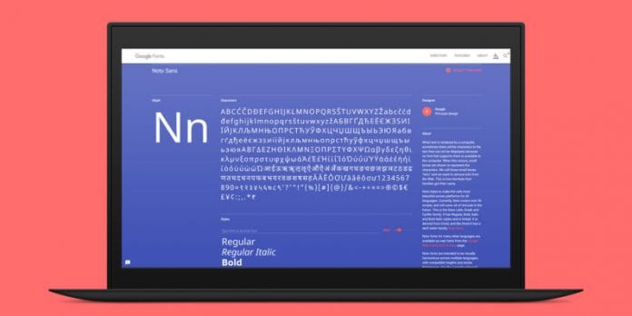
If your phone or computer cannot show a font, you usually get a black rectangular box that shows in its place called “not defined” or .notdef, which many people refer to as tofu.
This is not something that Bob Jung likes. This dislike of his can be traced back to the 1980s, in Tokyo, where he had an American computer in his possession. According to Jung, in those days, American computer was known not to have fonts in any other language, which was why the appearance of tofu was very common.
Now fast forward to many years later when he joined Google, he made sure that his first priority when taking charge of Internationalization department of Google, that the products the company offered was going to work every other place. Jung and his team spent not less than 6 years with help from Monotype designers to make sure tofu was not seen in Google’s devices. This is why they made use of pan-language fonts that are known as Noto (meaning “no more tofu”) that are also cohesive. With Noto, 800 languages were accommodated as well as 100 scripts that are in different 8 weights plus special characters that are too many to count, and of course no tofu.
With Noto, a lot of issues that many people do not know are in existence get solved. If your writing is in Hindi, English, Russian, or Mandarin Chinese, there will be no tofu. Unicode supports these languages, and is the consortium that is responsible for maintaining and approving emoji software for internationalization standards that many devices already come with.
This, however, still poses a challenge since many people write in languages that are innumerable. It was only lately that Tibetan was approved by Unicode with many others still waiting in line. According to the creative director of Monotype, Steve Matteson, languages that are less common will not be recognised because of the presence of a digital typeface. Matteson was in charge of the numerous linguists, designers, and researchers in equipping Unicode-enabled script a font without it looking like it was not part of the family of the same typographic family.
What was obtainable in the past is that it was platforms that will license fonts that various scripts piecemeal – script covering large number of languages that rely on Latin script. So for French and Spanish, a Latin script will be bought while for Arabic, another script will be bought, and then another for Chinese and Japanese.
According to Jung, some fonts do not just go well when there is a mixture of languages. There are some fonts that Monotype typographers had to use stone engravings from the scratch to get inspiration.
The main purpose for all these efforts is to come up with fonts that are not so different and looks like they are not related, Matteson says. He made Noto to be friendly and yet modern with soft terminals, open counters, as well as strokes that are rooted in calligraphy of 5th century. He also tried to make sure that Noto did not appear to be too austere since some shapes cannot translate like some other languages would.

When you take a look at the Noto family you will see some shapes that are common all through with some semblance to depict continuity. Some languages appear taller than others like Asian languages but they have details that are impressive with a bond that is a cohesive visual language.


