Whenever you finish a task as a freelancer, or you sell a product for example, unless this happens in person and your customer receives a bill on the spot, you need to find a way to make that transaction official and give them some sort of a receipt. And, what better way to do this than by sending an invoice.

In this article, we’ll help you learn more about creating an invoice, what are some of the key elements you need to focus on, and we’ll point out the things that make your invoice look professional and like it’s coming from a very serious client. Eager to learn more? Let’s take a look.
1. Include the most important contact information, all of it
Both sides need to know who the invoice is for and who it is coming from. It’s just like the end of a movie, you look at the credits to know who made it. We included this on our number one spot because that’s how we feel like every invoice should begin.
Including your name, the name of the company you operate or work for, your address, and contact information in the top left or top right corners is how you should begin. But, leave some room for the logo, because that’s what represents you or your company.
2. Add a logo, it matters a lot more than you think it does

Having a professionally designed logo is more than crucial for the long-term success of your business, but that’s not really what we’re here to talk about today. If you already have a logo, adding it to your invoice is recommended. Choose the position yourself. You can center it, place it in the top left or the top right corners. It needs to be the focus of the invoice. When a person opens it, it’s the first thing they need to see. If you still don’t have a clear idea of how to do this, visit here.
Plus, it’s nice to cause some contrast and make the invoice look “friendlier” instead of it being a simple wall of text.
3. Don’t be afraid to add your due date
The person you are working for needs to know when the deadline to send the funds is. Don’t think of this as being “pushy” or something similar, because every invoice needs to have a due date added to it. This will also correlate with the fees you include in your policy later on. These fees come into play in case you are not paid on time.
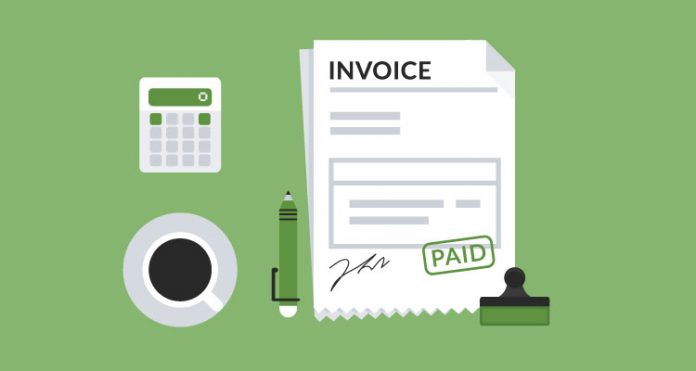
Adding your due date should be positioned somewhere near the area where you introduce your client to the amount they have to pay. Below the sum itself is usually fine, but feel free to modify things based on the template you are using as an example or the design you have in mind. You can then add your signature or a stamp that represents your company. Add some room for any extra notes in case you operate a business where most payments require you to write things in the invoice or do any modifications.

4. Use a PDF format for export, it’s the industry standard
How the final export of your invoice looks like is important. Sending a word document or even worse a screenshot that they should print and write over is a catastrophe. Don’t do that. Use a PDF export since that’s the industry standard and following it speaks professionalism on its own. Exporting in PDF is easy and takes just a few clicks. If you use Microsoft Office, especially Microsoft Word, you know how to do it. If not, a quick Google search will point you in the right direction.
This is only one solution, of course, and you can use various online checkouts as well, which are just as clear and professional. This shouldn’t cost you any money, and it requires small effort from your side yet, it makes a huge difference, showing that you are a professional.
5. Include all of your policies just to be clear upfront
Policies and terms are mandatory. In case the client doesn’t end up paying you, they need to know what follows. You can, later on, use this as evidence in case things complicate and you need a lawyer. It’s also pretty professional to add them, just to let the client know how much the fees will be later on in case they miss some of the deadlines. Terms of conditions are not only about price. You can add many important things in this field, such as where the funds need to arrive, etc… You can finish up with a thank you to make everything look friendly and warm.
6. Understand that complicated doesn’t mean professional

Last but not least, you should know that keeping things simple is better compared to complicating. Trying to make your invoice seem complicated with the hopes of leaving an impression that you’re professional is not good. Simple designs are always more efficient. You can use multiple colors to make it more user-friendly but don’t mix a lot of them unless the entire theme of your company or you as an individual is based on different shades. For the design itself, try to match it with the colors of your logo and you’re good to go.
Conclusion
Whether you want to pay someone or get paid yourself, a professionally-looking invoice is what you should be putting together upfront. Today we covered the most basic yet really helpful tips and tricks to make your invoice look good and well-composed. This is useful for freelancers or those starting with their businesses right now, so if you don’t have your invoice template, you’ll find all the answers within this article. Thank you for reading.


