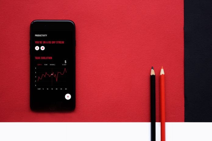
Less is more is the concept that is becoming mainstream and seeping into every possible aspect, from fashion to interior design and even technology. This trend is coined as ‘Minimalism’ – it personifies elegance and sophistication.
But how does this concept fit into the technological landscape? The area that minimalism inspired or influenced is the UI design of a website or a mobile app. The clean looking web or app design focusing on giving a sleek look yet keeping the contents to a bare minimum is in high-demand. You can say that minimalist UI design is the innovation factor in the realm of design. ‘High On Aesthetics’ – One can say.
Via UX Planet
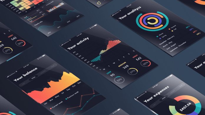
Since UI plays an integral part in user experience, applying minimalistic UI design can become tricky, albeit its simple facade. So what could be the best route to take for UI designers? Take inspiration from the works of others and follow the simple principles of minimalistic UI design.
Visit here before diving into the principles, what are the benefits of having an uncluttered, aesthetically pleasing, and almost an ‘art’ like UI design?
Advantages of a Minimalistic UI Design
The bottom line is that minimalistic design works. Businesses require a UI design that not only gives them an impeccable user experience efficiently showing the full potential of their product, but also facilitate conversion – that is from visitors to potential leads. So, how does a minimal UI design helps? Here are some of the advantages provided by the latest design trend.

Clean and Simple Navigation
This actually makes it easier for the users to navigate and focus; instead of the cluttered page with tons of options. This strategy works perfectly for driving engagement, as you can simply place a call to action statement with something assisting it (like a button taking them to the said activity).
Optimized Loading Time
With so many options and competitors in the market, it is hard as is to retain a visitor’s attention to your site or app, and if it takes longer to load – then you most likely lose that potential lead. So minimal UI design curbs slow load time and higher bounce rates by loading the page quickly because there isn’t much on it to slow it down.
A Site to Remember
A clean look with an artsy style that speaks about your product has higher chances of being remembered than a design that has too much going on.
SEO Approved
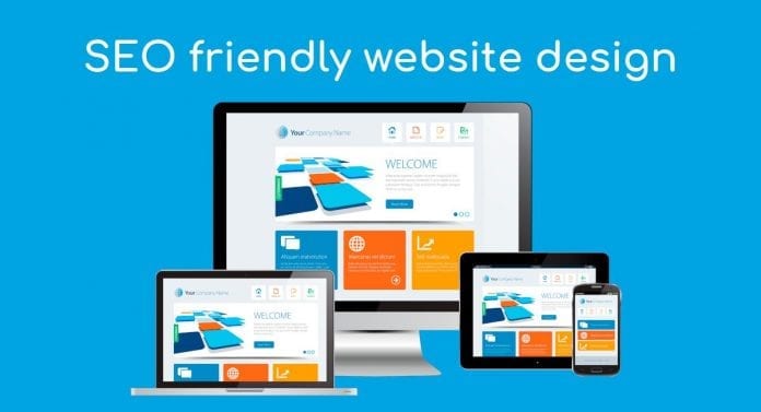
Search engine ranking and visibility are some of the crucial aspects of any business. A minimal UI design has less happening in terms of code on the front-end and the back-end, making it easy for the bots to crawl. Not only are you making your design SEO friendly but also user-friendly. Win-win!
Reduced Complexities
Naturally, with fewer complexities involved in building a UI design, the chances of errors, or unexpected bugs are reduced considerably.
These advantages play a significant role in curbing the challenges of app abandonment, which, according to a report by Localytics, is 24%. In comparison, only 37% of users use an app for 11 or more times. So the competition is stiff.
Principles of a Minimalist UI Design
Now, how can you achieve a minimal UI design? With a few simple principles in mind.
#1 Color Palette
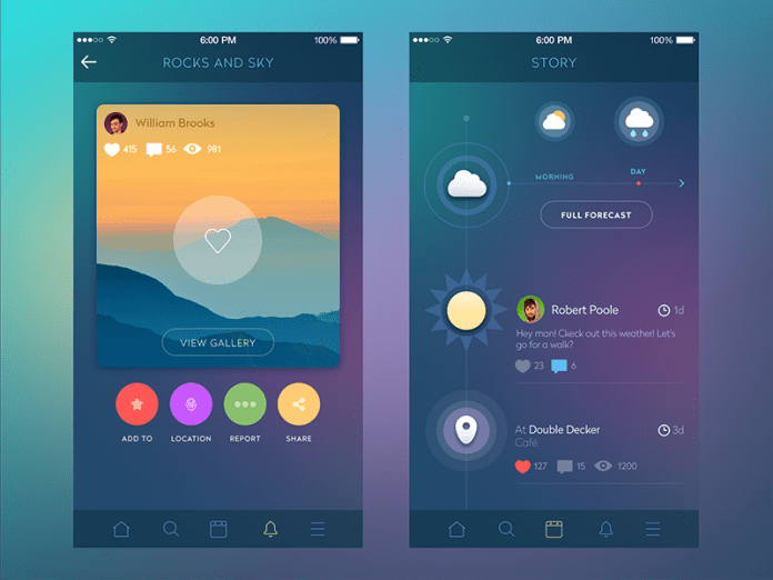
Something not of the highest priority in otherwise a regular UI design, but when it comes to minimalism, color scheme takes center stage, as they set the tone of the user experience. So there are many predefined color schemes available for you to pick and apply, but here’s what you can start with:
- Monochromatic: A popular choice among the UI designers, as it includes different tints of the same color. This gives a nice contract yet keeps uniformity, as the base hue is the same.
- Analogous: This type of color scheme includes three colors that are next to each other on color wheel.
- Complementary: This color scheme allows you to make some of the elements shine from the rest. These colors are opposite each other on the color wheel.
#2 White Space

A much-hated aspect once is now a critical element, tying the entire color scheme together. Moreover, white space in a color scheme stands out, so using it smartly and to divert the attention of the user to the important elements on the screen is vital.
#3 Typography
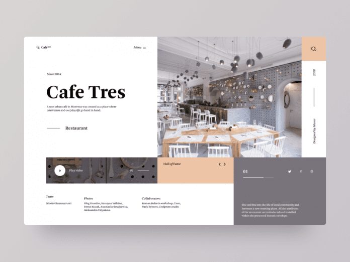
Determining the typeface and deciding a font style, size, and space that would appeal to the users is another part of a successful minimalist UI design that required a great deal of attention. Here are the important aspects to keep in mind when deciding typography.
- Fonts: Mobile platforms, in particular, have default fonts you can choose from.
- Font Size: Apple suggests 11pt min, while Android suggests 12sp.
- Space: 10 to 20% of space is recommended between the text for better readability and beautification.
- Line Length: For desktops 60 characters and for mobile apps, it is 30 characters.
#4 Images & Icon Placement
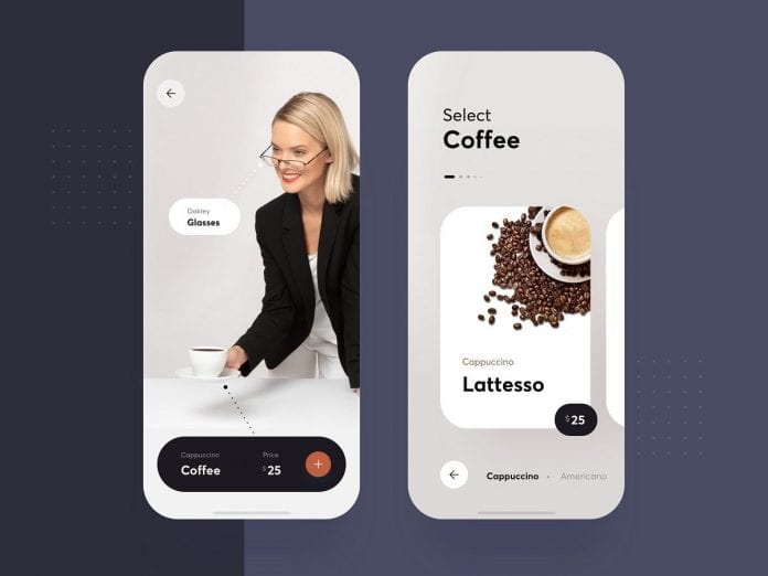
Not as simple as it is in a regular UI design – be it a mobile app or a website. You need to be quite strategic in how you want to place your images, icons, and buttons. When it comes to minimalistic UI design, each picture conveys a message and serves a purpose. As for the icons, they too are either replacing text and are self-explanatory or are helping in navigation – for that; you should always make sure they are simple, recognizable, and memorable.
#5 Extensive Planning
Although this should have been the first pointer, as a reminder, it needs to be mentioned last. Since creating a seamless, enjoyable, and true to the spirit of minimalistic UI design requires time, effort, and planning – it is important that you do rigorous planning of every detail. Once everything is planned and mapped out, it becomes easy for the designers to create a marvelous UI design.
Final Thoughts
AI and impeccable user interface designs have been adding largely to seamless user experience. As noticed by AppVerticals, this is why many mobile app development companies have been incorporating the latest design trends to their web and mobile app designs to appeal to the customers – and minimalistic UI design has been proving to be a winning strategy.
