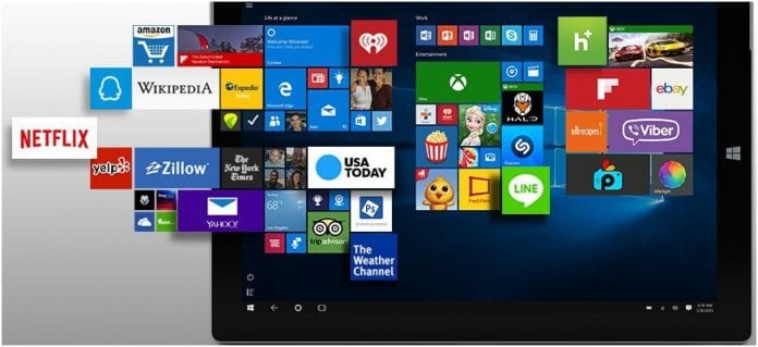
Microsoft wants to create a universal app platform through its Windows 10 software. The approach is believed to be one of the factors that will help with the lack of apps and also will bring in developers and more users to the platform. Therefore in that regard, the company has been offering guides to help customers and users optimize their apps in ways that are more efficient.
One of the latest tutorials that teach such by Microsoft for the Windows 10 developers is in the navigation forum. Microsoft usually emphasizes on the ways to make an application easy and also intuitive to navigate so that they can be able to attract more customers and get a big user base.
The company has given their different parts which are all being focused inconsistency, simplicity, and the clean interaction. These three will be able to offer some valuable information to the developers who can be looking into the various ways and methods that they can improve the navigation functions of their apps with.
One of the developers in the Microsoft team said that the navigation of apps is usually the one way which promotes the ease and efficiency of the apps. It is not only down to the design aesthetics. Unlike various other topics pertaining to apps, which in many ways rely on personal taste and interest as well as an awareness of the fashion changes in the world, the navigation function together with the UX, is usually dependent on the usability research was done by the companies. The developer also says that navigation should be in line with what the user expects from the app, and should lean more into the standard conventions which are available for icons, locations, and the styling.
Read news about Windows 11!
One of the interesting icons on the guide is the hamburger menu. The menu is described by Microsoft as one of the essential parts of its interface. According to the company, users always expect this icon to be on the left side of the screen on the top left corner. This icon can also be replaced by anything you want. This is where the hamburger icon comes in, and it is the best practice because it makes all things become more of a traditional thing across all the platforms.
Through this method, developers can get consistency on the Windows platform, and also various other platforms which will be essential considering the fact that the apps will be available on various platforms. The tutorial is an eye-opener for developers, and it is good to see companies engage with the clients and users and providing helpful information.
The universal app concept still needs some time to mature, but if you plan to develop some Windows 10 apps in the near future, it is best to give it a read.


