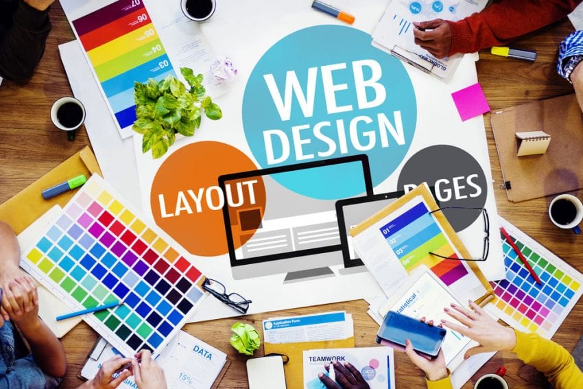
The way your website looks is very important to the image of the company. Your website is the image of your company and visitors will mainly judge it based on its appearance. Sometimes this is what it takes visitors to determine whether he or she will decide to look at your site or continue searching for a different one.
You don’t want to avert your customers and visitors and to send them to competitors right away, so what you want to do is to make your site look presentable. Various ways can help you achieve a more professional look of your site. Whether you are using an automatic website generator or a skilled webmaster designer, there are still some things that you can do to make your site better, likable and viewable.
Here are some ultimate tips to make your website better looking.
Keep Things Simple

A professional looking website does not require too many elements. In fact, most professional sites that really look good try to keep things simple. If there is too much clutter in the way it makes navigating a website much harder for the visitor.
Think of it this way, when you go to a high-end store you usually do not see so many things on display. In fact, most of the items are tucked away and neatly laid out for you to see. The same approach needs to be taken for a website.
Try to declutter it and remove all the unnecessary details. Make it more manageable and easy to navigate. It would be best to think of making it user-friendly when designing it and to keep only the most important elements.
Interaction With Visitors
People who visit your site are your target audience. You will probably determine your target audience based on the product your site is promoting. So the main thing is to keep those people happy and to enable the website to provide them with what they need.
One of the best ways to retain the visitor’s attention is to communicate with them. This is usually done via e-mail or social media, or whichever way the visitors choose to use. The best way to give your visitors a voice is to allow them to leave comments or reviews on your site.

Thus, a professional site can incorporate the use of a review generator to gather more comments for other visitors to see. This is particularly hard when a website is new and is still gathering visitors, so a review generator can really be helpful in gathering the initial comments on your site. The best review generators usually prompt people who buy products on your site to leave a comment or a review. It is done automatically and allows you to filter the comments or ways these messages are sent. You can learn more about these helpful tools here and use it as an advantage for your website.
Bigger and Professional Images
One of the first things that catch a visitor’s eye are images on your website. This is the first thing a person notices and is often the thing that makes them stay and see what the site is all about. This means that you have to use the best, quality pictures that you can.
Of course, the best way to do it is to use pictures taken by a professional photographer and then have your web designer incorporate them within your site. But these kinds of services are really expensive and newer sites can rarely afford them. Try finding cheaper but good-looking ones on the internet and make sure that they are eye-catching and of better picture quality.

Another thing to watch out here is to use bigger pictures. The current trend that you may see on all leading sites is that bigger pictures are used. When you enter a site, you will see a big picture of the main product with little ones or none around it. Try using this strategy to make your website more professional.
Utilize Icons
In order to make your website intuitive and easy to maneuver people often use icons. But icons are not only used to help you understand and navigate the site better, but they are also a part of the visual appeal of the site. So it is very important to use the correct icons and design them well.
You have to follow the theme of your website. For instance, if the look of your site has more oblong shapes, you should make the icons circular, not square. Also, make sure to incorporate buttons that are universally used for specific things so there is no confusion.
Lastly what you have to think about is color. There are different colors which are popular at certain times. Design your icons using the color specter that goes together and tries to blend it with the site. It will make it more visually appealing and allow it to catch the eye of the audience.
Useful and Engaging Content

The content on your site should be useful to read and should explain everything clearly to the visitors. Actually, all the content given on your webpage is very important as it explains to the user what he can do with your site. If the explanation is unclear, not a lot of people will stick around to learn more, no matter how good your site looks.
It is highly important to add enough written content, but not too much. You should add only the necessary explanations and leave everything to the visual design. Another thing to watch out for is making the written content engaging and error-free. Many sites suffer from bad grammar and unclear explanations, so you should not want your site to be one of them.
Many webmasters are capable of adding quality content, but in the end, you should hire professional content writers or native speakers to write content for you. It will make your site look tenfold better.


